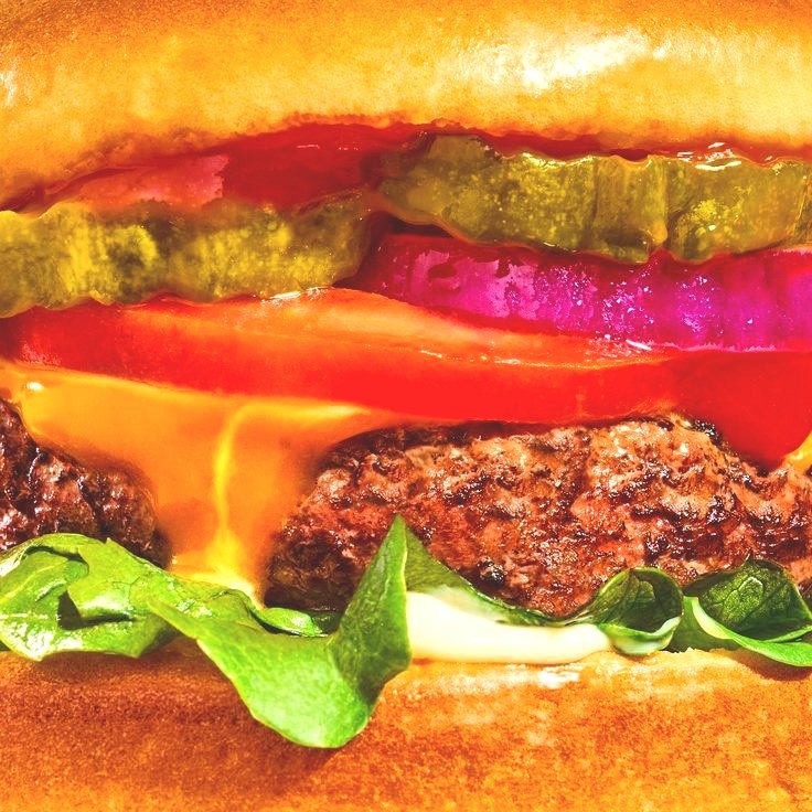
Photography examples
My process
When I started designing I knew I wanted “Zest” to be locked up within a lemon. I always start my designs by sketching first and trying a few things out.
My next step is to bring that design into Procreate to start building it out and testing out colors.
My last step is to bring the design into Adobe Illustrator to finally build it out.
Zest | The Rebrand
I wanted to create a logo that could be recognizable, have a clean lock up, and leaned into the brand name using citrus color. The new logo has the ability to be taken apart and used in a variety of different ways in comparison to their current logo.


